The RisoLAB Logo: An Evolution
When the RisoLAB first opened in September 2015, there was much work to do on the logistical front. How would the RisoLAB operate? Would we charge fees for hourly usage, or would students pay per print and master?
What were the minimum requirements for training? How much ink should be kept on hand? Who would keep the RisoLAB open during open Lab hours? And how would we pay for it all while keeping our space accessible and affordable to both SVA students and the broader NYC art community? These immediate issues had to be addressed before we could open our doors, but we also had classes to promote and a sustainable business model to prove to the school administration.
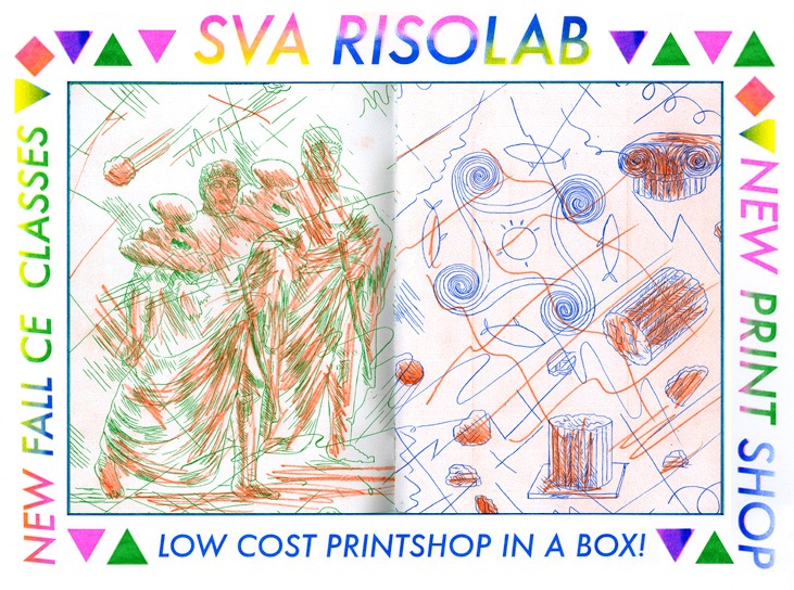
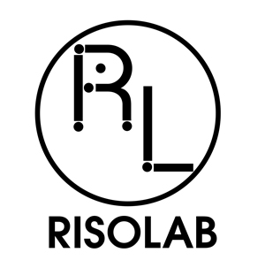
We had to hit the ground running, with a basic website and logo to begin to give our brand new space an identity at the very moment that it was forming. Our early logo was designed quickly, and while it was clean and serviceable, it didn’t quite capture the spirit of Risograph printing or what the space could become. It was a good initial placeholder, with its ink tube stand-in for an “I” and color bar gradient as a reference to the graphic conventions of printing and printmaking, but it was a little too much of a clean, Illustrator derived vector image. After doing the job for our first year, it was time for our humble logo to evolve into something that better represented the spirit of what our space had begun to develop into as well as our vision for what it could become.
The RisoLAB was created as an inclusionary space to provide print training and access to Risograph printing facilities for any kind of visual creative who might want to use these machines for creative expression and communication in print. In 2015, those who were aware of Risograph printing as used by artists already had a vague sense of what it looked like-something involving bright colors, inconsistent registration, and that distinct Risograph texture that resulted from soy based ink passing through the natural fibers of a thermal master stencil.
However, our space was intended to prove that Risograph printing could be used to print any kind of artwork, design, or photography based content imaginable. While the space would eventually become home to an idiosyncratic community of diverse creatives who continued to sign up for Lab access semester after semester upon completing a class, the Lab itself had to be neutral, clean, reliable, and efficient. We needed a logo and graphic identity that reflected the RisoLAB as a state-of-the-art printing space for technical experimentation, with the newest machinery and a wide range of colors, staffed with print experts and faculty who were pioneers in the uncharted territory of Risograph printing and publishing.
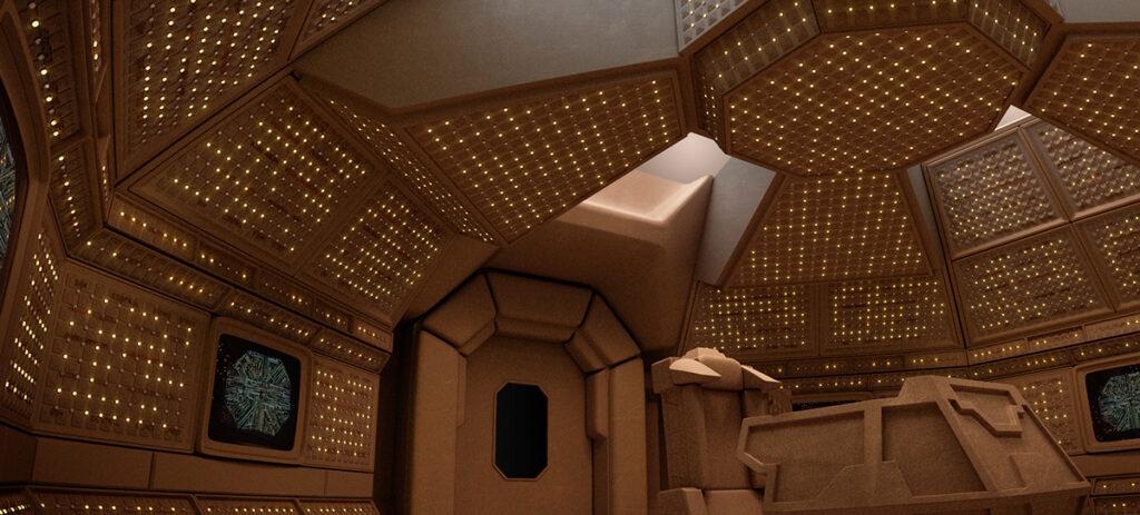
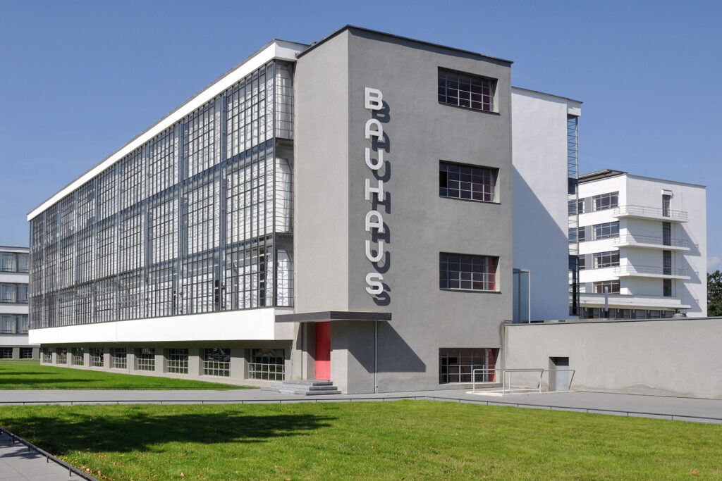
Our reference points were the spirit and graphic identities of Bell Labs, Nasa, and the Bauhaus, as well as retro-future sci fi aesthetic of the spaceship Nostromo from the 1977 film Alien.
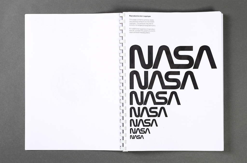
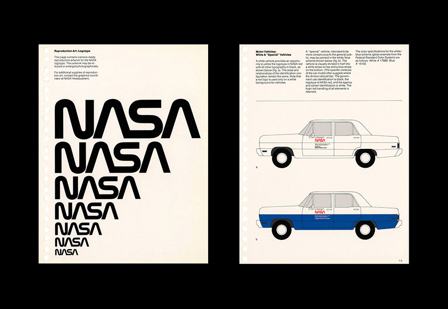
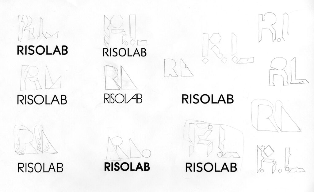
RisoLAB co-founder Panayiotis Terzis got to work, beginning with pencil sketches that were subsequently scanned and then turned into vector based designs in Adobe Illustrator. The starting point had to be a logo that would be powerful and instantly recognizable, and would work perfectly in monochrome before color entered the picture. Shapes that seemed to capture what we were going for were paired with appropriate fonts, printed out and examined to see if they held up outside of the digital design arena.
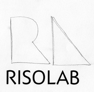
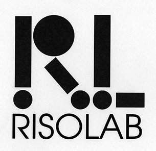
The spirit of these designs came close to what we had in mind, but it took many attempts and revisions to get it right. The challenge was to find a balance between a spirit of play-
and technical rigor.
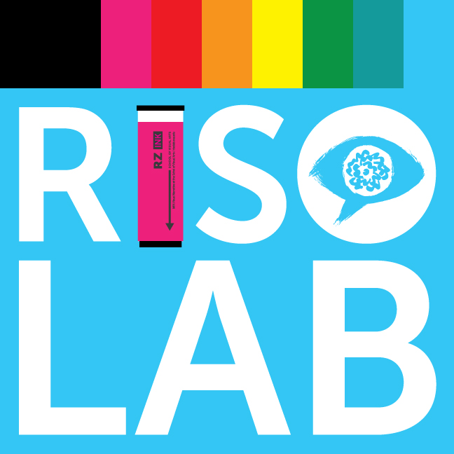
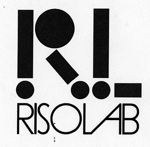
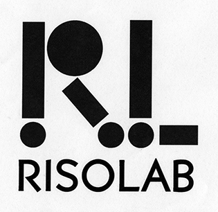
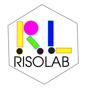
Finally Pan hit on something that seemed to work. What became the final logo was built out of the classic 1970s font ITC Avant Garde Gothic, with some subtle and not so subtle interventions, adjustments, and edits. Since it was finalized in the spring of 2016, this logo has served us well, appearing on our posters, brochures, publications, and across this website, as well as in the form of a laser cut sign in neon plexiglass that is mounted above our entrance door.
![]()